Ex Augsburg is a magazine by students about former students of the University of Applied Sciences Augsburg.
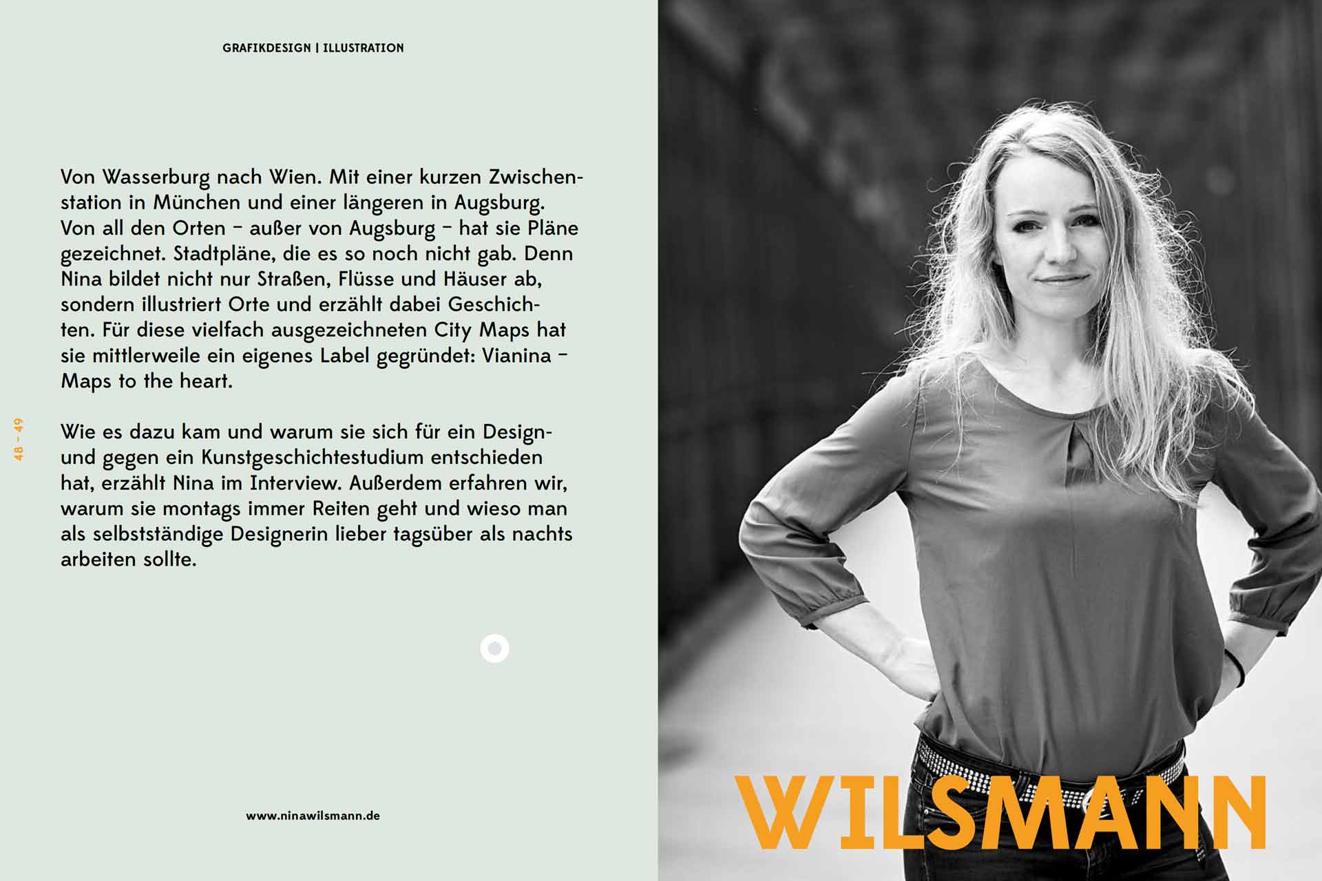
From Wasserburg to Vienna, with a brief stop in Munich and a longer one in Augsburg. From all these places—except Augsburg—she has drawn plans. City maps that didn’t exist before. Nina not only depicts streets, rivers, and buildings but also illustrates places and tells stories along the way. For these multiple award-winning city maps, she has now founded her own label: Vianina – Maps to the Heart. In an interview, Nina explains how this came about and why she chose design over art history studies. We also learn why she always goes horseback riding on Mondays and why self-employed designers should prefer to work during the day rather than at night.
CITY INSTEAD OF TOWN
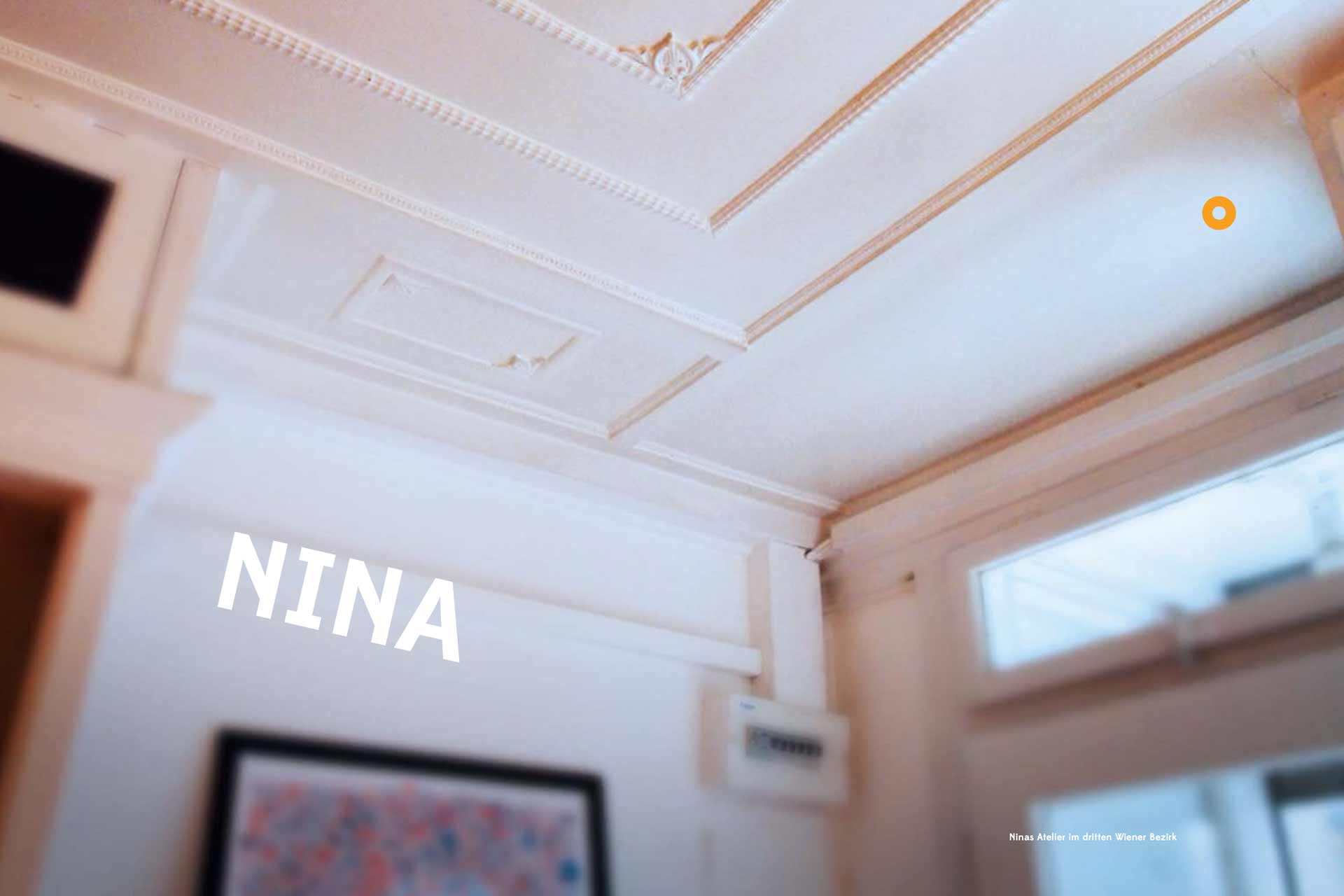
Vienna, third district. Between the Danube Canal and the Belvedere Palace lies Nina's studio. There, we are greeted in the early morning with a bright smile. Nina leads us through her beautiful studio up to the first floor, where a kitchenette, desk, and a small sitting area are located. For an hour, we will chat with her here. Let’s go!
YOU STUDIED ART HISTORY IN MUNICH FIRST AND THEN SWITCHED TO COMMUNICATION DESIGN. WHY?
In career counseling, they said that graphic design requires a lot of elbow grease. That, along with all the entrance exams, made me quite uncertain. In my first studies, I attended classes for a while and realized that it was just too theoretical for me. I wanted to do something practical. That’s why I chose design instead of art history.
WHY AUGSBURG AND NOT MUNICH?
At that time, Augsburg simply had the better reputation. In our shared apartment, we had parties from day one, and it was somehow the exact opposite of Munich, where I never felt at home.
DO YOU HAVE ANY OTHER SPECIAL MEMORIES OF AUGSBURG?
Yes, plenty. Back then, we were still in the old hospital, which was quite a fun time. We had calligraphy evenings where the wood stain ended up on the walls. People sometimes smoked during lectures. You could really let loose, and I think that’s great.
YOU'RE ALREADY WELL ESTABLISHED IN YOUR CAREER. WHAT SHOULD ONE DEFINITELY DO DURING THEIR STUDIES, IN RETROSPECT?
Get a taste of agency life. Many had to do an internship after graduation, but I didn’t because I already had a lot of experience. This made my entry into the professional world much easier. Likewise, the semester abroad, getting to know other countries and seeing how other graphic design students work, is one of the most formative things one can do.
WHAT EXPERIENCES HAVE YOU GAINED WITH YOUR EMPLOYERS?
Very diverse ones. Some were good, but there were also less pleasant experiences. I’m really glad to be self-employed now, but especially in the first years, you learn an incredible amount from your bosses and colleagues. I deliberately never worked in large agencies because I wasn't interested in that; I always wanted to be involved in everything. Writing proposals, handling print requests—while these can be the more boring tasks, it’s important to see a project through from A to Z. Customer contact is also crucial; I think it's very important to learn how to deal with clients, and I definitely did during that time.
YOU HAVE THE DIRECT COMPARISON BETWEEN SELF-EMPLOYMENT AND AGENCY WORK. WHAT DO YOU APPRECIATE ABOUT EACH?
In an agency, you obviously have much less responsibility and receive your salary every month. A downside is that you can’t choose your working hours freely. I find that very unnatural, especially in our profession. Creativity doesn’t happen on demand. With self-employment, it requires self-discipline and organizational skills, but I think the freedom is the best part.
WHY WAS IT VIENNA AND NOT HAMBURG OR BERLIN?
Funny enough, I wanted to go to Berlin or Hamburg. However, I didn’t quite warm up to Berlin. Hamburg would have been my preference. After my father suggested that I go to Vienna, I sent out unsolicited applications and was indeed invited for an interview. It felt right from the first moment, so it became Vienna.
HOW WOULD YOU DEFINE YOUR FIELD OF EXPERTISE?
That’s an interesting question. I keep pondering that. I love designing logos, but the city maps are becoming more and more significant. I just did a tablet illustration for Sony, and my shop is also doing better. The city maps represent a completely different business. While it can be challenging to do both, the variety is what makes it enjoyable.
HOW DID YOU GET INTO ILLUSTRATING CITY MAPS IN THE FIRST PLACE?
Back in school, whenever I was bored, I used to combine simple abstract shapes. For my first application, I wanted to present myself with my roots. During that process, I remembered that style and illustrated my hometown, Wasserburg. Since I enjoyed it so much and it was well received, I later illustrated Vienna as well, which had the advantage of me being much more familiar with the city.
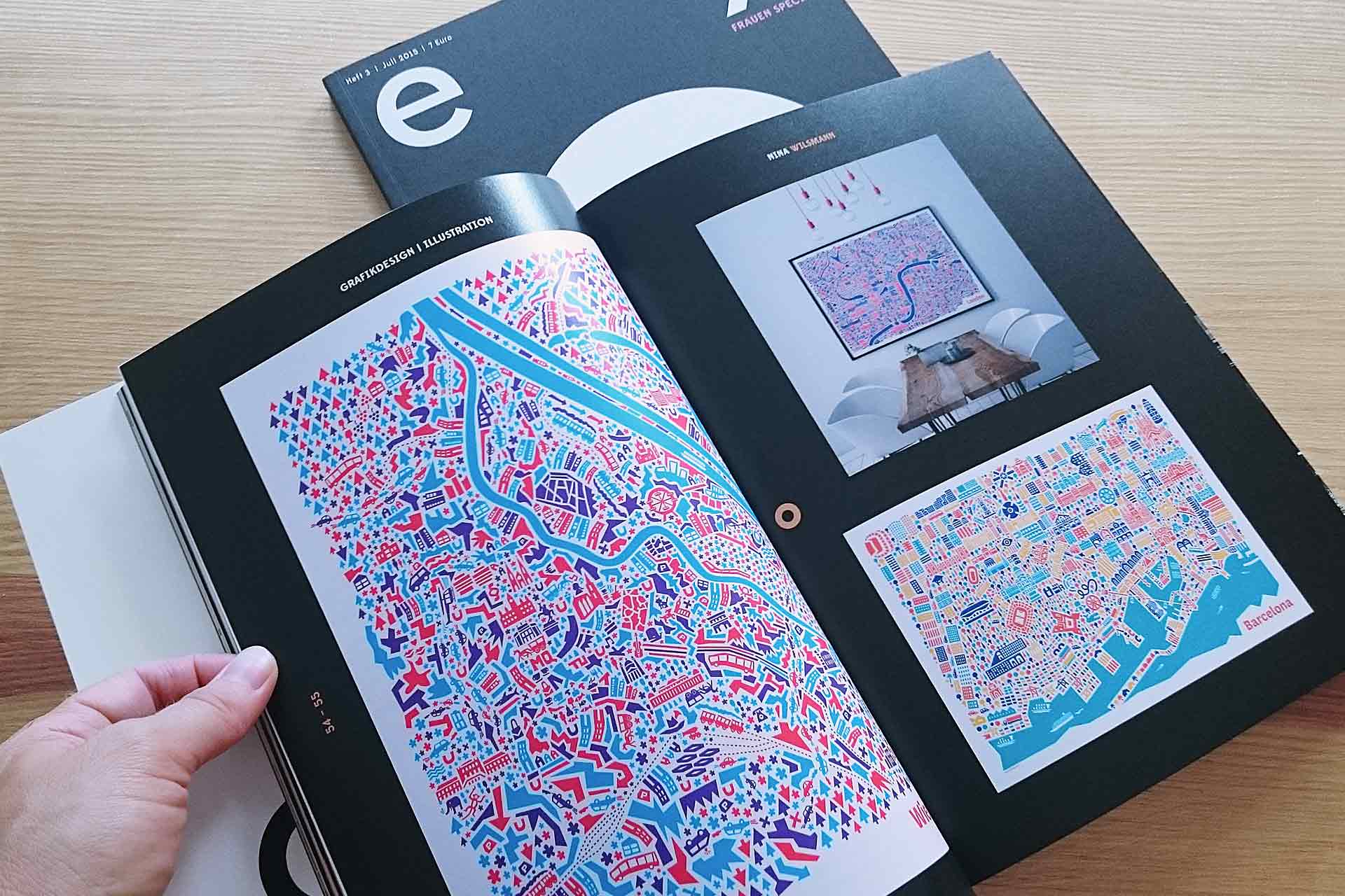
DO CITIES NEED TO MEET CERTAIN CRITERIA TO BE ILLUSTRATED BY YOU?
Yes. I noticed with the Hamburg map that water plays an extremely important role in the layout and structure. I also prefer cities that function well economically; cities that are touristically appealing are naturally easier to sell.
HOW LONG DOES IT TAKE YOU TO CREATE A POSTER, AND CAN YOU LIVE OFF IT?
I usually work on a poster for about three months, and yes, I could almost live off it by now. That’s incredibly nice.
DO YOU HAVE A FAVORITE CITY MAP?
I feel like my style evolves with each map. Right now, it’s Barcelona. For one, I lived there for three months, and the colors of Gaudí's Park Güell inspired me. Everything came together so well that I’m really happy with it.
CONGRATULATIONS ON THE AWARDS FOR YOUR POSTERS. HOW IMPORTANT ARE THEY FOR YOUR PROFESSIONAL LIFE?
Thank you! I always thought they weren’t important, but interestingly, they really are. It’s not that you can’t succeed without them, but when I first won at "100 Best Posters," things started to take off. People reached out to ask where they could buy them, and so on. It opens doors and brings much more attention.
YOUR LABEL IS CALLED VIANINA. WHAT DOES THE NAME MEAN?
I stumbled upon "Via Nina," a street whose existence is somewhat uncertain, and that was an AHA moment for me. Yes, exactly, that’s it. It’s like my path, tying into the city map and having a bit of Vienna in it. It just fit so well. Plus, the domain was free—jackpot! [laughs]
WHAT ARE YOU CURRENTLY WORKING ON? THE ILLUSTRATIONS FOR SONY?
Those have been completed for a while. Then came the engraving, and now we’re in the press phase, which I don’t have to worry about anymore. Each year, I work on a fun event called the "Austrian Brass Band Festival," organized by the cultural department of Vienna. They approached me through "100 Best Posters." I’m designing the posters again this year. And right now, I’m working on a logo and corporate design for a fashion label in Germany.
DO YOU HAVE A MORE ACTIVE PHASE AT NIGHT OR IN THE MORNING?
Well, I’m not an early riser, but I’ve also gotten out of the habit of working at night. Daytime is when people contact you. If you work at night, you’d actually have a round-the-clock job.
TO WHAT EXTENT DO YOU TAKE YOUR JOB HOME WITH YOU? CAN YOU CLOSE THE DOOR AND SAY, THAT’S IT?
[LAUGHS] No, you can never really do that. That’s a problem you have to work on. You can actually develop sleep issues because your brain just won’t stop running. That’s why I go horseback riding on Mondays; it’s perfect for switching off. Still, the best ideas often come at the most inconvenient times, even at night. Unfortunately, that’s how it is. You have to learn to let go over time. That’s important; otherwise, you’ll go crazy.
WHAT WOULD YOU HAVE BECOME IF YOU HADN’T STUDIED DESIGN?
That’s funny. I’m really glad it worked out in Augsburg. I didn’t have a real Plan B.
SINCE YOU LIKE READING, DO YOU HAVE A RECOMMENDATION FOR US, A TYPE OF DESIGN GUIDE?
An absolute must for me is the hefty tome "Detail Typography," which details every little rule of typography. Even if only three percent of the world’s population notices it, I find micro-typography extremely important, especially if you’ve studied in Augsburg. You should have it and keep referring to it when you’re unsure about separating certain number combinations or where specific em dashes belong. I can spot it immediately when it’s not done correctly. That’s the nerdy part of our profession, but it really adds that final touch of quality. Once you’ve internalized it, it doesn’t take much time, and you’ll sleep better. [laughs]
THANK YOU FOR THIS BEAUTIFUL CLOSING STATEMENT!
You’re very welcome!