Metropolises for the Living Room Wall
Interview with Graphische Revue
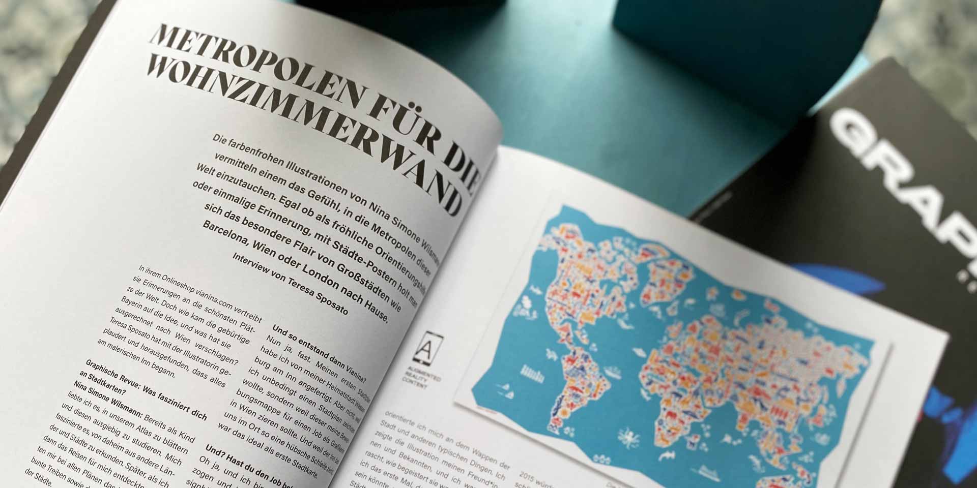
The colorful illustrations by Nina Simone Wilsmann give you the feeling of immersing yourself in the metropolises of the world. Whether as a cheerful guide or a unique memory, city posters bring the special flair of big cities like Barcelona, Vienna, or London into your home. In her online shop, vianina.com, she offers memories of the most beautiful places in the world. But how did the native Bavarian come up with the idea, and what brought her to Vienna? Teresa Sposato chatted with the illustrator and found out that it all started by the picturesque Inn River.
GRAPHISCHE REVUE: WHAT FASCINATES YOU ABOUT CITY MAPS?
Nina Simone Wilsmann: As a child, I loved leafing through our atlas and studying it extensively. I was fascinated by exploring other countries and cities from home. Later, when I discovered traveling for myself, I missed the hustle and bustle, the colorful activity, and the unique charm of the cities in all the maps.
AND THAT'S HOW VIANINA CAME ABOUT?
Well, almost. I created my first city map of my hometown, Wasserburg am Inn. But not because I necessarily wanted to draw a city map, but because it was meant to decorate my portfolio for a job as a graphic designer in Vienna. And because the Inn makes such a lovely loop in our town, it was ideal as my first city map.
GRAPHISCHE REVUE: DID YOU GET THE JOB?
Nina Simone Wilsmann: Oh yes, and I moved to Vienna, working three days a week at the design office and two days as a freelance graphic designer. This mix of security and flexibility was perfect for me at first, and I was familiar with it from my time in Augsburg, where, after studying "Communication and Design," I also served my first own clients alongside my work at the graphic office. But after many years in Augsburg, it was time for a change. My parents suggested Vienna, and here I am.
WHEN DID YOU KNOW YOU SHOULD FOCUS SOLELY ON VIANINA?
It was a process. The starting point was definitely my job application and the subsequent move to Vienna. To get my bearings here, I drew the city in this special style. I based the colors on the city's coat of arms and other typical things. I showed the illustration to my friends and acquaintances, and I was surprised at how enthusiastic they were. That was the first time I felt there could be more to it, and I began illustrating other cities too: Hamburg and Berlin.
HOW DID IT FEEL WHEN THIS FIRST SERIES WON AWARDS?
It was an incredible feeling. I submitted the series to "100 Best Posters" – actually just for fun and out of curiosity – and I was indeed among the 100 winners. This led to my maps being exhibited at the MAK in Vienna, and I was also honored with the Joseph Binder Award and the German Design Award. That was really special for me, but I still didn't think about commercializing the maps back then.
AND HOW DID THE VIANINA ONLINE SHOP COME ABOUT?
People kept asking where they could buy the items, so the online shop was the next logical step. By then, I had already drawn other maps of Paris and New York and sold them at Fesch'markets in Vienna, for example. Since 2015, I would say I have been working exclusively for and on Vianina, and I look forward to everything that is yet to come.
HOW MUCH OF YOUR CITY PORTRAITS HAVE YOU EXPERIENCED YOURSELF?
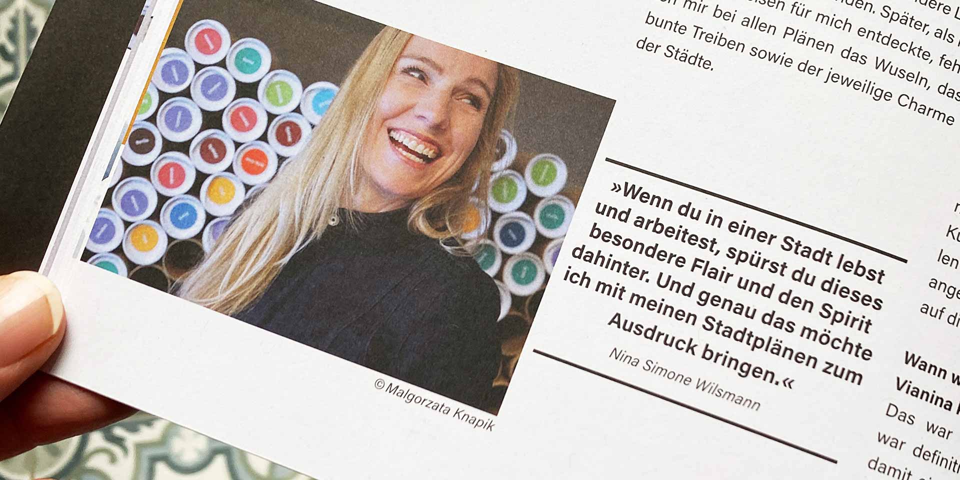
A lot. Traveling has always been one of my absolute passions. I am also lucky to have a job that can be done from anywhere, so I lived and worked in Mexico and Budapest for a while. During my studies, I studied and worked in Barcelona, and those times inspire me for Vianina. When you live and work in a city, you feel its flair and spirit. And that's exactly what I want to express with my city maps.
HOW DID YOU COME UP WITH THE NAME VIANINA?
I thought about names for months, and one day – bam – Vianina came to mind. At first, I wanted to dismiss it right away because it seemed too simple. But then I saw more and more the significance in it and how accurately it reflected me and my city maps. I also like that it sounds like a Roman road. And: It's friendly. That's very important to me because I want to convey a piece of the friendliness and cheerfulness of big cities.
SPEAKING OF CONVEYING: WHAT IS THE INTENTION OF VIANINA? WHAT DO YOU WANT TO ACHIEVE WITH IT?
I want to give my customers the same feeling I had as a child when looking at my atlases: a mix of curiosity, anticipation, and childlike discovery. I also display my items at markets, and I find it wonderful when people examine my maps in detail and are happy to discover a landmark that means something to them. People have so many memories of city trips that are brought back to life a little bit through this.
AND IF WE OPENED YOUR COMPUTER NOW, WHAT MAP ARE YOU WORKING ON?
You would see drafts of Zell am See and Florence.
BUT THOSE ARE NOT CLASSIC METROPOLISES, ARE THEY?
No, but that's what makes it so exciting. Illustrating a small town and capturing its tradition and quaintness is the challenge. Two years ago, I realized a project for the 5th district. It wasn't about illustrating the whole city but just the district. We also printed the maps on drawstring bags and notebooks, and it's a really cool feeling when someone in the subway is carrying the drawstring bag.
WHAT IS YOUR ABSOLUTE FAVORITE PROJECT?
Luckily, there are a few. But if I had to pick one, it would be a project with Sony from 2014. I drew a map of Vienna that then adorned the back of their latest tablet. The challenge was, of course, the monochrome engraving. That and the collaboration with Sony made the project my favorite.
HOW DOES A CITY MAP COME TO BE? HOW MUCH RESEARCH GOES INTO IT?
A lot. Especially for cities I'm not very familiar with, I research for weeks to get a good impression of the country and its people. Currently, I'm drawing Florence, and I'm delving into the Renaissance, the Medici, and trying to immerse myself in the city.
AND THEN YOU START DRAWING?
I always try to find a section that shows as much interesting detail and as little periphery as possible. It helps me to use a real map, like Google Maps, as an underlay. The maps should be charming, but also realistic and informative. That's very important to me.
HOW DO YOU CHOOSE THE COLORS?
They convey the mood at first glance. The right colors are crucial in my work to illustrate the flair of a city. These are decided right at the beginning, and they rarely change during the process. I either base them on the city's coat of arms – in Florence currently on the Medici's coat of arms, so red and yellow. For Rome, for example, I used the Italian flag and added brown for the wonderful coffee and turquoise for the typical Vespas. In London, the colors of the Union Jack. In all my maps, I usually work with four colors to get enough contrast and clarity. I also make sure that the same colors don't touch and that highlights are drawn with the strongest color.
WHERE DO YOU START WITH A CITY MAP?
I imagine the first stroke to be the hardest. Almost all cities are on bodies of water, so I usually start with that. Then I add the main landmarks.
WHAT DO YOU USE TO DRAW YOUR MAPS?
By hand. I use my graphics tablet with a stylus and draw all the buildings freehand in Illustrator. But it wasn't always like that. In the beginning, I worked much more roughly and drew with the mouse. Today, my style has become much more precise and refined. Over time, you get more routine and confidence, which has also evolved my maps over the years.
WITH BUILDINGS, HOW DO YOU FIND THE PERFECT BALANCE BETWEEN DETAIL AND MINIMALISM?
Not always equally well. Because I tend to overcomplicate things or draw them too complexly. I keep going over them, removing unnecessary details, and simplifying detailed illustrations. I used to work in corporate design, where I learned the art of eliminating anything that hinders aesthetics or the message. This minimalism or clarity means showing as much as possible with as few lines as possible. Often it helps to print everything out on paper during the design process. The new perspective allows me to see with the necessary distance.
DO YOU ENJOY DRAWING ON PAPER?
I love drawing on paper. But with the maps, it's practical to use Illustrator because I can constantly change things. I can optimize and correct everything until I'm satisfied.
AND WHEN YOU'RE 100 PERCENT SATISFIED, WHAT'S NEXT?
Then it's time for printing. It's always a wonderful thing to hold my maps in my hands once they are printed. I work a lot with natural and recycled papers. I like the feel, and I also appreciate the ecological aspect. The slightly rough surface allows for rich colors. I find screen printing the most beautiful, and we have also screen printed the world map and the Vienna map. It gives everything a different feel. Even with textiles, my illustrations are screen printed on organic cotton fabrics. We haven't worked with enhancements – except for the golden city map of Prague. But who knows what will come next.
Nina, thank you for this conversation!